Role:
Experience and Design Lead Timeline:
Jan 2024 – Jan 2025 Responsibilities: UX team leadership, journey mapping, design, prototyping, user testing, and visual design Key Skills:
Experience strategy, UX, test design, visual design, client management
As part of a consulting engagement with CommonSpirit Health—one of the largest healthcare systems in the U.S. with over 2,200 care sites across 24 states—I led efforts in design and UX for a major website relaunch. The primary focus was improving core functionality around physician and location search, a critical entry point for patient engagement.
Search is the foundation of CommonSpirit’s digital experience, acting as the primary bridge between patients and the care they need. However, previous design attempts had fallen short in accommodating the system’s scale and complexity. The physician and location search tools—vital to appointment scheduling and patient navigation—were underperforming due to fragmented patterns and inconsistent user flows.
Strategy100 %
Experience90 %
Interface80 %
Visual70 %
Our work involved designing interoperable search tools that maintained consistency across the site, with particular attention to scalability and future-proofing the patterns. We collaborated closely with stakeholders to ensure that the tools aligned with CommonSpirit’s patient-centered mission.
We began by identifying the most common user journeys—most notably, patients starting their search with a specific provider in mind. This insight shaped our design direction. Our team focused on creating a seamless, intuitive search experience that could flexibly handle multiple use cases, from finding a specific doctor to locating nearby facilities.
At the time, CSH was one of the three largest health systems in the U.S., so there was a substantial amount of motivation to make sure the physician selection process supported the business. The agency had attempted to solve the physician and location search problems but had run into problems developing patterns that were robust enough to handle the daunting number of variables involved.
Overview
Problem
Facilitate meaningful connections between patients and caregivers; avoid user attrition by delivering more relevant search results.
Goals
Deliver an online experience that manifests Commonspirit’s patient-oriented nature by providing valuable, user-friendly tools and experiences.
Metrics
Adobe Analytics
Google Analytics
CRM conversion points
EHR trends summarized by volume
Website/competitive audits
Opportunities
Make finding a medical specialist easier
User-friendly and efficient location search experience
Improve satisfaction of patients and prospects
Optimize on-site media and content search
Reinforce new CHS brand identity
Research
2.9M Total Visitors
5.3% On Page Click Rate
9.6%Blog Search Engagement Rate
79% Homepage Bounce Rate
Stakeholder interviews underlined aspects of the legacy site experience that had proved problematic from an internal perspective. By combining this with data about user behavior, we were able to get a more holistic viewpoint about what could and should be done to address things. Following a thorough competitive audit, we were able to identify areas in which other approaches were more successful than Commonspirit’s legacy model. By overlaying this with key decision points and frontend component requirements, we began to establish a roadmap for the experience that served as a source of shared truth. Common scenarios and edge cases were written to determine whether or not future work would hold up to real world requirements.
Analytics also emphasized the need to focus on the appointment-setting process – the next step in the journey. This was where the most users were bouncing out of the funnel. Ultimately, all successful conversions would end there at some point, so we paid particular attention to the places where we might be able to offer assistance to users instead of just more work. Accomplishing this began with research into the various varieties of type-ahead searches and process requirements, like enabling geolocation.
What we learned formed the basis for a new roadmap intended to manage all future CSH digital properties. The goal was to synthesize user, business, and technical requirements into a single visual form that illustrated the way everything worked together. This culminated in the development of a generalized user journey for all searches designed to locate a caregiver.
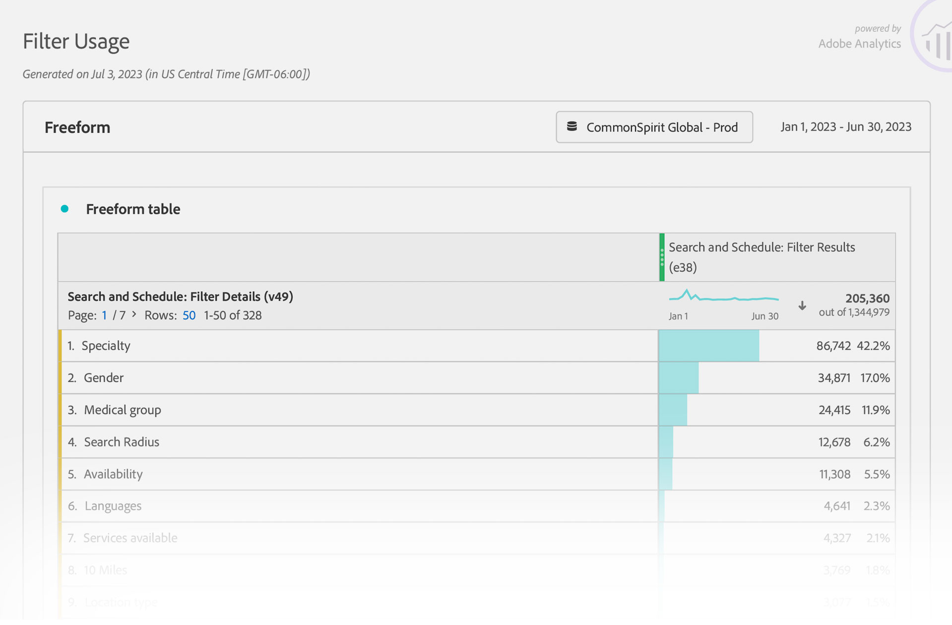
Our team also began to determine what scenarios we’d need to address when designing the actual experience, along with the way in which the searches would appear to users. One of the most critical considerations was the cards that displayed each search result. These needed to be streamlined; providing only the most critical information and leaving out anything that might get in the way. This would help ensure that a search was as quick as possible and clearly aligned with user intent.
Commonspirit was in the midst of unveiling a new brand voice and visual identity system that provided an anchor for our work. Because this project was midstream, the client was anxious to establish a shared repository for the new brand elements as they were created, and to highlight how they worked together. Developing the smaller Brand Center website was another way we were able to being building a style shared by all client properties.
The Brand Center site also gave us the beginnings of the new Commonspirit design system. We worked our way from mood boards to wireframes with an eye towards reuse on the flagship site. We were also able to establish areas where the current component set was not deep enough or user friendly enough to match up to the competitive experiences from our research. In combination with the roadmap, a “best-of-breed” archive was created to store good ideas and begin to adapt them to the business requirements of the new site as appropriate.
Testing
Our interview process underscored several factors that were negatively impacting engagement. The journey to care often begins with a simple search. However, for many users engaging with CommonSpirit.org, that search resulted in confusion, frustration, or abandonment. Due to the vastly diverse range of potential users and motivations, user personas were not deemed an effective approach due to their narrow and fictionalized nature. Focused research was used instead, as it was more granular and could be linked to precise real-world interactions.
Those interactions were then used to develop user archetypes to test against. Drafting a solid plan for doing so required that our “types” aligned with the demos depicted in the analytics. The 12 archetypes we developed helped to further validate the scenarios we were writing. For this reason, our classifications needed to mirror key facets of the user base to ensure real-world behaviors were closely matched. The initial scenarios from our roadmap were then tested against each persona to spotlight where extra effort would likely be needed.
Oliviathe Researcher
50, newly diagnosed with cancer. Seeks clinical trials, specialist care, and trustworthy content. High digital literacy and needs detailed provider info.
To validate our design decisions, we ultimately identified 12 user archetypes that reflected key audience segments and behavioral patterns. These archetypes served as the foundation for our test planning. When simulated tests provided actionable insights, these were rolled into the first round of complete prototypes. We then conducted a series of usability and performance tests with actual users relying on a blend of automated and moderated methods.
03/12
Carlathe Mobile Mom
31, first-time mother, seeks maternity care and OB/GYN reviews. Values financial transparency and mobile-first appointment booking.
04/12
Luisthe Multilingual Entrepreneur
38, warehouse owner. Needs urgent care for employees in Spanish, flexible scheduling, and clear insurance help for people after workplace injuries.
05/12
Marythe Content Queen
29, freelance content developer, avoids in-person care unless urgent. Wants fast access to virtual visits, cost transparency, and mobile booking tools.
Instead of relying on static wireframes, we built interactive prototypes that mimicked the real experience of searching, filtering, and comparing results. These prototypes were used directly in usability sessions, giving participants the sense of a functioning product. This allowed us to gather more authentic feedback and validate the direction before things went to far in a single direction. Automated testing provided broad behavioral insights and helped flag friction points at scale, while moderated sessions allowed us to observe real users in context, offering deeper qualitative feedback tied to each archetype. The outcomes of the stories and scenarios were compared by applying a series of framing questions. This dual approach ensured both coverage and depth, grounding our refinements in real user behavior. The overall effect was to sharpen the experience even further by incorporating features like the ability to compare multiple caregivers before making a decision.
Testing made it clear that some of our approaches did not meet user expectations due to oversimplification and an over-reliance on “happy path” outcomes. Cumulatively, these edge cases represented a large group whose needs were not being met. A second round of interviews made it clear that we would need to carefully consider user queries contextually, and not as a single block. Focusing more closely on how, where, when, and why a search was initiated helped us to identify exceptions and errors that were likely to occur. By offering more specific paths to resolution that addressed these friction points in the process, the likelihood of a successful outcome was increased substantially.
QControls
Which element of the interface does the user interact with first – visually and with the cursor? How long does this initial event take?
QJourney
If a journey isn’t completed, what triggers the user to abandon their search? How much time do they invest to get there?
QUsability
If multiple queries or refinements are requested, how many attempts are made? Does the user restart their search, use filters, or both?
QGoals
Is the search conducted for a doctor or a location? How many results are returned before a selection is made, and at what distance?
QResults
Does the result selected have a profile image? Is it a custom or default image? How many total selections are made?
QExceptions
If an exception or an error is triggered, how did the user arrive at that point? Does the event fit any commonly observed pattern?
QPreferences
If insurance is specified, does the user exclude out-of-network care providers? Do they use the comparison feature?
QConversion
Does the journey include setting an appointment? Is it for themselves, or someone else? How many visits are required first?
QEngagement
Does the user engage with content not directly related to their search? How many, and were they pages or posts? How much total time is spent?
Improving the doctor search process gave us a leg up on the next step; creating a better location search. We had learned that appointment searches were closely tied care facilities, even more so than the actual care provider. Factors like driving distances and insurance accepted became important considerations that influenced whether or not an appointment was actually made.
Other aspects of a patient interaction; such as whether or not a certain language was spoken; were equally significant. To address this, we designed overlapping filters that changed dynamically to more closely match the specific path a user was on. For example, if a doctor was not seeing new patients, we were able to surface other doctors at the same facility that would. We could also provide the user with suggestions for nearby practices that might meet their requirements.
After multiple rounds of research, testing, and optimization, the team had arrived at what we felt was a solid overall approach to meeting the requirements, and we began to work on other areas of the site. This included things like the diseases and conditions library (a natural place to link caregivers to patient issues), the blog, and the utility pages. Throughout the site, we linked anchor content to user intent using a taxonomy derived from our initial roadmap. More engaging content appeared to result in better retention elsewhere in the journey. We also discovered that performance continued to improve as we moved from wireframes to more finished designs. Working closely with the development team, we used iterative visual testing to ensure that the final product matched the quality of the creative. Even so, we continued to learn there were additional gaps as the process unfolded.
Lessons
20M
Total Patients
117
Total Automated Test Subjects
In the end, the story wasn’t about whether users could find care—it was about how many gave up trying. The experience needed to become not just more functional, but more human.
The majority of user interactions remained related to locating a physician or a facility, with physician searches, with the majority of them starting with the caregiver. This is where we had started our ideation process, as we had determined it would ultimately be a part of most other search operations. User data and qualitative feedback continued to reveal key breakdowns in the site experience—beginning with the search functionality itself. For example, in instances where users did not enable geolocation, the platform frequently returned null results, with no fallback suggestions, alternative prompts, or additional help. This lack of support at a critical juncture increased user frustration and reduced task success rates.
The appointment-setting process also suffered from inconsistencies. There were exceptions in availability that contradicted what was initially shown to users. For example, appointment slots presented as available were occasionally revoked after selection, creating dissonance and eroding trust in the reliability of the system.
Another significant challenge was the handling of search facets. Users frequently encountered interfaces that either surfaced too many or too few filtering options, resulting in search errors. When overexposed, users felt overwhelmed; when underexposed, they were unable to meaningfully refine their results. This tension contributed to a broader pattern of user dissatisfaction during the search and discovery phase. Survey data reinforced these experiential observations.
Interestingly, users across age groups were generally open to AI-driven scheduling tools, so long as these tools demonstrated efficiency and offered error tolerance. The use of machine intelligence was not rejected outright, but expectations around precision, transparency, and fallback mechanisms were high.
Impact
6.3% Traffic Increase
9.2% Higher Search Completion
12.8M Est. Business Value
:21More Page Time
The final relaunch of the site was deemed a major success, as objective metrics and subjective anecdotal feedback bore out our creative decision-making. While it is true that there is a low bar for expectations from an onsite healthcare search, research indicated that this was due to the lack of detailed information available. This had given us an opportunity to add value by providing a more complete resource with more angles to view the subject matter from. Developing the journey maps for user search and appointment setting required overlaying the quantitative and qualitative data, and distilling the key moments and inflection points.
After 6 months of operation, it was readily apparent that the site was getting positive feedback and garnering additional revenue based on its higher conversion rate. Developing a component set – and kickstarting a nascent design system – gave the initial designs the capacity to grow organically over time. Deviations from primary traffic paths also also continued to be important. These included the media section of the site which covers blogs, news, and events, and enhancements to the interface of the treatments and conditions library.
Usability
Reduction in dropped searches
More appointments booked using the new system
Less user frustration related to search
Results better matched user need and intent
More engagement throughout the entire site
Fewer phone calls and in-person inquiries
Findings
Users continued to browse after obtaining results
Stickier content can drive higher search rates
Surfacing too few or too many results caused bounces
Mobile search was often driven by place and time
Ratings were viewed as critical to care selection
Better visibility into patient intake drove success
Successes
Improved completion rate for physician search
Improved completion rate for location search
Improved overall website traffic
Increased net revenue for the health system
Improved interface and tightened funnel gaps
Developed algorithms for ranking care by specialty
Created a backlog for continuous imporovement
Backlog
More compelling micro animations at key moments
Need more accurate data provided by physicians
Doctor and location detail pages often had blank sections
Implementation of third-party API for ratings
Expand support for meaningful use of EHR data
More featured testimonials and patient input
Increase depth of treatments and conditions content
Despite the broad scope of the improvements, issues remained. In particular, these were items that fell outside the initial scope. Noteworthy among them were remaining generic errors in the scheduling system when the inputs included a certain set of variables. Other areas for focus in the near future include the integration of limited patient records, and filling in areas of the physician and location templates that remained unpopulated.
Physician and location templates will be continuously optimized based on analytics data. Additional improvements are also planned to the post archives, with unique templates for the specific types of time-stamped content. There is also a plan in place to integrate third-party reviews in the physician templates, to replace the site-specific rating system that currently exists.